3. Review of Related Work and Literature
This chapter will examine some of the current work being carried out in the area of Human-Computer
Interaction and user interface design, and includes a brief look at the subject of participative design.
3.1 Computer-Based Testing
Since the 1980's, and the arrival of the home computer, many psychologists and others have investigated and
discussed the impact of computer systems on children. From theories of addictiveness on one side,
to benefits from the use of suitable educational software on the other hand, there have been many
differing views. One positive effect of this research was the realisation that microcomputers could be
used by psychologists in clinical practice. The use of such systems with children with a range of
disabilities has been considerable, and to much good effect. For example, research has shown that
communication via computer (for example, putting a questionnaire on a computer, and asking people to
answer the questions there), can alleviate some of the stress experienced in interpersonal communication,
even in the case of severely disturbed adolescents [Zimmerman, 1987]. A trial in which reasoning problems
were presented to college students either by computer or human tester produced the following report
[Johnson & Baker, 1972]:
Computer-run subjects are more apt to pause for long periods of time without typing anything into the computer.
Human-run subjects may feel under some pressure to keep behaving even at the risk of doing something wrong.
Computer-run subjects have been heard (through the semi-soundproofed wall of their cubicles) to shout for
joy, curse, bang the walls, and sing, certainly modes of expression which a typical subject avoids in the
presence of an experimenter.
Another positive feature of computer testing, is the computer's ability to choose test items in the
light of the user's previous scores. Adjusting the difficulty of tests so that the user is not put
off is likely to improve motivation.
There are, however, possible negative aspects to the use of computers in psychological testing:
"Computers don't make mistakes" - It is possible that people tend to believe
the results of a computer program even when it is obviously wrong. Also, if software is out of
date, so that the results of the program are no longer valid or the assumptions upon which it is
based have been disproven, then it is possible that erroneous results may be taken as correct
results [Groth-Marnat & Schumaker, 1989], simply because "computers do not make mistakes".
Unstandardised behaviour - If a test is completely administered by computer any
unstandardised observations that could have been recorded by a skilled clinician would be lost.
Unstandardised behaviour can be regarded as those behaviours the interface is not designed to sample.
This could include verbal comments, facial expressions, and non-verbal behaviour such as tapping
the desk impatiently.
3.2 Human-Computer Interaction Issues
There are a number of HCI issues which must be considered when designing computer systems, since
many aspects of complex computer systems depend upon interaction with people. Psychologists trained
in the areas of cognition are well suited to offer help in the design of such systems. This has
lead to the study of human-computer interaction, and the application of well-known psychological
principles to the development of computer interfaces.
3.2.1 Memory
Work by Campbell in the area of memorisation [Campbell, 1982], shows that people do not remember
complete events, but simple sets of rules which allow events to be reconstructed. Every event is
recorded in terms of previous events. It is this phenomenon which makes us remember the one occasion
in which something out of the ordinary happened, but not the hundred-other times where nothing
extraordinary occurred. If a person is already familiar with something, then it does not need
to be memorised, and this is the power behind the use of metaphors (see section 3.2.3). These
observations lead us to the conclusion that by using a simple conceptual model, few rules need
to be memorised to form an accurate user model, and hence the user will find the system easy to
use. Furthermore, it is possible to design systems so that they themselves act as a repository
for information that would otherwise have to be memorised by the user.
The display of a computer [can act as] an external memory that is an extension of the
user's own internal memory, one with which he can remember and keep track of more information
than otherwise. [Card, Pavel & Farrell, 1985]
3.2.2 Consistency
One of the aspects of computer systems which can make them easier to use is the concept of
consistency. All Macintosh programs should adhere to Apple's "User Interface Guidelines",
which hold that Macintosh programs must embody three qualities: "Responsiveness,
Permissiveness and Consistency" [Rose et al, 1985]. Responsiveness has to do with users
perceiving their actions to have direct results, thus operations are performed intuitively.
"Permissiveness" means that the program must allow the user to do anything which is
reasonable, and should avoid narrowing choices unnecessarily. "Consistency" has to do
with all Macintosh applications behaving in the same way where this is feasible, so that having
learned how to use one application, the skills acquired are transferable, and the user can
apply these skills when using another application.
"Consistency asserts that mechanisms should be used in the same way wherever they occur"
[Smith et al., 1983]
Consistency both within and across applications leads to reductions in training time
[Polson, 1988]. Consider, for example, if every
word-processing application that you
ever used employed different keys for special function such as underlining or bold text,
or if a single application had many modes where certain keys had different effects. Such
an application would be difficult to learn, and would be likely to be difficult to use,
and the knowledge gathered as the result of learning one application would be of little
help in using any other. Compare this with applications which use a standard set of
operations, and simply add to those for purposes specific to the application. Once you
had learned the operations for one application, this knowledge could be transferred to
the domain of other applications.
3.2.3 Metaphors
The User Interface of the Macintosh has undergone rigorous user tests to see what
works and what does not, and Apple have a User Interface team who work on modifications and
enhancements to the interface as embodied in the Macintosh. Most users are introduced to the
Graphical User Interface (G.U.I.) of the Macintosh via the Finder, that part of the Macintosh
operating system which handles file and disk operations. The Finder employs the metaphor of
the desktop. This has been chosen to suggest to the user the way in which they are expected
to interact with the computer. A desk often contains documents and tools for operating on
them such as pens & pencils etc. Metaphors are useful tools in the design of user
interfaces, as they can anchor a user's understanding of the computer to some other domain
with which they already have a familiarity.
The metaphor is perhaps one of man's most fruitful potentialities. Its efficacy verges on
magic, and it seems a tool for creation which God forgot inside one of His creatures when He
made him. [Gasset & Ortega, 1925]
Appropriate metaphors can help make an interface intuitive, though they can have a number of
disadvantages. One problem in their use lies in those aspects of the interface that have
deviated from the chosen metaphor sufficiently to cause confusion.
Metaphors serve as natural models; they allow us to take our knowledge of familiar objects
and events and use it to give structure to abstract, less well understood concepts.
[Erickson, 1990]
Another difficulty with metaphors is that there is currently no methodology for finding
suitable ones, and it is unlikely that any exist for complex systems [Norman, 1986].
Carrol, Mack and Kellog suggest that there are, however, sources for generating metaphors
[Carroll Mack & Kellog, 1988]:
Predecessor tools and systems - base the new metaphor on an existing
system that the user will have some experience of.
Human propensities - the new metaphor could exploit some aspect of the
user's real world. Pointing and dragging for example.
Sheer invention - a new metaphor could be created by designers based
on their intuition that it will provide sufficient context to permit understanding.
A further problem with metaphors, is the possibility of differing interpretations by
different users. Sometimes a user's background or experience will colour their perceptions
sufficiently to confuse what would otherwise be clear.
3.2.4 Programming for Errors
It is the usual stance of the programmer, that no-one will make a mistake in using a program
that they have written, and so there is no need to take into account the effect of an
erroneous action, or permit the user to "change their mind" about something. Program
designers need to remember that everyone makes mistakes, and that not
being able to recover from them can lead to frustration with the program, and thence to a
dislike of the program, and eventually to an unwillingness to use it.
If an error is possible, someone will make it. The designer must assume that all possible
errors will occur and design so as to minimise the chance of the error in the first place,
or its effects once it gets made. Errors should be easy to detect, they should have minimal
consequences, and, if possible, their effects should be reversible. [Norman, 1988]
Whenever a user has to make a choice, they must subsequently be able to discard their choice,
and choose again. Program designers need to:
1. Understand the causes of error and design to minimise the causes.
2. Make it possible to reverse actions - to "undo" them - or make it harder to do
what cannot be reversed.
3. Make it easier to discover the errors that do occur, and make them easier to correct.
4. Change the attitude towards errors. Think of an object's user as attempting to do a task,
getting there by imperfect approximations. Don't think of the user as making errors; think
of the actions as approximations of what is desired.
[Norman, 1988]
If designers follow these rules, the user is more likely to want to use the system, since it is
"forgiving" of mistakes, the sort of everyday mistake that any person might make.
3.2.5 Providing a Feature-Rich Environment
The constraints of any programmed system lead to limitations on the range of options available
to the user at any one time. Attempts should be made to provide the user with "room for manoeuvre"
without being too restricted in the range of possible actions. The general problem is summed up by
the Turing tar-pit metaphor:
Beware the Turing tar-pit, in which everything is possible but nothing of interest is easy.
[Hutchins Hollan & Norman, 1986]
and the converse of this
Beware the over-specialised system where operations are easy, but little of interest is possible.
[Fischer & Lemke, 1988]
Somewhere in between the two extremes lies the optimal system. Any computer system which attempts
to model real-life situations cannot offer the full range of options which would be available,
there are simply too many alternatives. Instead, one possible answer is to present
enough options, in order to give sufficient choice, whilst not limiting the
possibilities needlessly. Another approach which could be used in tandem with this would be to
use hierarchical choosing tools, which would at a stroke limit the number of alternatives that
need to be offered at every step. Limiting choices and disregarding inappropriate options is
particularly important where the user of the system is young or inexperienced.
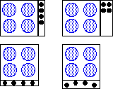
Many items we use every day would appear meaningless without training. Consider the
controls on a cooker: most of the controlled items are distant from the associated switches
and knobs, and the operation of switches vary - some are rotary, some push and others slide.
Often the layout of the controls does not match the layout of the hobs, grill and oven (see figure 3.1).
Some electric ovens have the grill as part of the oven, and have more than one knob to
control the associated heating elements. Which knob controls which item, and how do they
interrelate? It is only by using such a system and creating a mental model, and perhaps using
skills learned from other such systems that a person can learn how to operate it. One
important aspect of a child's upbringing is the familiarisation with systems which are quite
complex, but which when learned, eventually form part of everyday life.

fig. 3.1 Four different cooker hob designs. The two on the left need to have labelled knobs,
since the connection between control and controlled item is not apparent from the control's
position. The two designs on the right do not, yet the changes in design from the left ones are slight.
3.3.1 Complexity
In terms of computer software, more control by the user is desirable, but an increase in the number
and complexity of tools for increasing the user's control has a negative utility
[Fischer & Lemke, 1988], and this is true in other contexts as well. Where a large number
of controls are required, it may be better to reduce the apparent complexity of a system by careful
positioning of the controls - hiding those that are not often required for example. Quite often
a small fraction of the functionality of complex systems is used. It can be seen that some
complex systems are easy to operate - consider driving a car for example. There are a large
number of components to a car, and yet the user of the car needs to be directly aware of only
a subset of them, the rest only being important occasionally. Compare this with the modern
digital telephone found in many offices (figure 3.2): many fewer controls, and yet despite
training sessions, many people cannot make their telephone perform more than the basic functions.

fig. 3.2 Digital office-telephone.
When a person uses a control to perform an operation they produce a mental model of the
mapping between the control and the result. This mapping need not be the actual
one, as long as it allows the person to remember that their action leads to the result.
There can be problems, however, if the mapping that is produced leads to some incorrect
assumptions about the underlying system. For example, in many cars the brake light on the
dashboard serves as an indicator that the hand-brake is on - courtesy of a switch on the
brake, and also to warn of problems with the braking system. Most drivers never see the
light used as a warning, and so if it is lit could be forgiven for thinking that the switch
on the hand-brake was not working properly. This conclusion could be a dangerous one.
A designer of a control needs to be aware that users will need to create the mapping,
and help them by perhaps employing natural mappings - physical analogies and cultural
standards [Norman, 1988]. For example, suppose that the designer wants a control which
allows the user to adjust an amount of something. A natural mapping for this is the cultural
standard that a rising level means more.
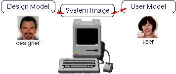
There are two mental models associated with every system (see figure 3.3). The first model
is the design model. This is the model that the designers have of how the
system should work. The design model is interpreted by the programmer to produce a
system image. The user sees the system image and creates a user
model of it in order to be able to work with it. This user model may sometimes
be very different from the original design model, and may carry with it ideas from other
designs that the designer never intended to be part of this one. This can lead the user
to actions which are inappropriate when examined in light of the design model, but which
are perfectly reasonable in the user model.

fig. 3.3 the two mental models associated with a system.
Any mismatches between the user's mental model, and the designer's mental model can be
reduced by the designer:
Develop a simple, smooth design model, reflective of the needs of the user, not the
limitations of the hardware or the difficulties of the coding process. [Tognazzini, 1991].
3.3.2 The Gulfs of Execution and Evaluation
The user's goals and intentions are separated from concepts and operations represented in
the system by two gulfs: the gulf of execution and the gulf of evaluation (see figure 3.4).

fig. 3.4 The gulfs of execution and evaluation between the user and the system.
The gulf of execution refers to the conversion of the user's goals and intentions into
actions that are required by the system. The gulf of evaluation signifies the problem
of representing the system's concepts and operations in a form which can be interpreted
by the user. According to Ziegler and Fähnrich [Ziegler & Fähnrich, 1988],
interfaces which rely on the direct manipulation of objects help bridge these gulfs by
allowing the user to utilise elements of the system's output as components of the user's
input language. In a direct manipulation system such as the desktop environment of the
Macintosh, the user can select an output from the system and continue to manipulate it
directly, thereby reducing the gulfs of execution and evaluation.
3.3.3 Feedback
Feedback is an important concept in the design of controls. The user needs to be aware
that an action has been performed. Consider how much harder it must be to talk to someone
if you cannot hear your own voice. The feedback given must also be appropriate to the
task. Some automated teller machines at banks give only audio feedback as you enter your
PIN on the keypad. Such systems are difficult to use if you cannot hear the beeps due
to high levels of background noise from cars etc. As computers have become more powerful,
the sort of feedback that they are able to give has become more varied. Consider the
action of copying a file from one directory to another. In early, less powerful computer
systems there would be little feedback; perhaps a message saying the file had been
successfully copied once the copying was complete. If you wished to stop the copying once
it had started there was no easy way to determine how much of the file had been copied, and
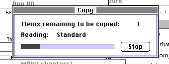
how much was left to do. In modern graphical computer systems, the copying process may appear
as a window indicating the progress of the copy (figure 3.5), and perhaps an animation of the
icon for the file moving from one place to another. This gives immediate feedback to the user
that an action is taking place, even if it takes an appreciable amount of time. Some systems
even present a button to enable the copying to be stopped - the user is always aware how
much is left to do, and can see that it is perfectly feasible to stop the copying.

fig. 3.5 - the Finder's standard file-copy progress dialog box.
Feedback is important even if the amount of time taken to do something is increased by
providing the feedback. For example, some CPU-intensive applications on the Macintosh
draw a progress dialog-box (such as that in figure 3.5 above) while they perform their
calculations. There is an amount of CPU power used to repeatedly draw the progress-bar,
and this is obviously not available to do the work whose state of completion the progress-bar
is indicating. It would seem at first sight that the best thing to do is to utilise all the
CPU power for doing the calculation, but by displaying a progress-bar, the user has feedback
about how much of the operation is left to perform, and by retaining the user's interest
the calculation may actually seem quicker as a result.
Crawford argues that a number of important interface lessons have been learned as a result
of the development of computer games [Crawford, 1990]. He suggests that in order to make an
interface more usable attempts should be made to:
Move away from the keyboard - although there are times when use of the keyboard
is necessary, it is often much more meaningful to gather input in a different form. Click
on a wanted item rather than type its name, move things around by dragging them, etc.
Make more use of Graphics and Sounds - It is often better to represent a concept
using sounds or pictures rather than using words. An image can often show a concept directly,
rather than describe it indirectly using text.
Don't leave your user in the dark - When a program is involved in something,
it is important that it should not ignore the user, but that it should provide some feedback
that an operation is in progress. Games designers have learned this lesson - your player will
get bored quickly if the game spends a lot of time processing without any feedback to the
user, or if its responses are sluggish.
3.5.1 The Mouse
The most important way that a user communicates with the Macintosh is via the mouse.
It has been shown that the mouse is faster than joysticks, step keys, or text keys for
positioning the cursor on objects.
The positioning time of the mouse is significantly faster than that of the other devices.
This is true overall and at every distance and size combination save for single-character
targets, for which it is roughly equal to other devices. [Card, Moran & Newell, 1983].
The mouse provides a good mapping of action to result.
The feature of the Macintosh mouse which distinguishes it from most other computer mice is
the fact that it has only one button. Some computer systems have two or three mouse-buttons,
but the Macintosh's operating system was specifically designed to work with one. The main
reason for this was as a result of user-testing by Apple. In early tests performed by
researchers at Apple, users were timed performing a number of tasks with the mouse, using
both single, and multiply-buttoned mice, and it was found that the single-button mouse was
faster. The reason for this appears to be connected with the way a mouse is used. A mouse
is simple to use because it embodies a metaphor for a concept which we learn in infancy:
that of pointing at things. The problem is that we do not usually care about which finger
we use to do the pointing, pointing itself is the aim of the exercise. In a situation
where it is important to use a particular finger to point, the person pointing has to
make a decision as to the appropriate finger every time they point, and this is true whether
they are expert pointers or amateur pointers. Experts may be able to decide which one more
quickly, but the decision is still required every time the action is performed. This is
precisely analogous to the mouse and the mouse-button. With a single-button mouse it is
obvious which button needs to be pressed. There is no choice to make other than "should
I press or not?". In multiply-buttoned mice a decision is required every time the user
wants to click a button. It is also possible that the uses for the mouse buttons are not
consistent or well-defined. This means that not only must the user make a choice about
the appropriate button, but also that the appropriate button may be different in different
programs, even if the desired effect is the same!
Problems with single-button mice do occur when it becomes necessary to press modifier
keys while using the mouse. These actions are difficult to learn and to remember, and
difficult to do. More mouse buttons would alleviate these problems, but at the cost
of increased complexity of the mapping of functions to buttons.
Whenever the number of possible actions exceeds the number of controls, there is apt
to be difficulty.[Norman, 1988]
The choice of one button for the Macintosh mouse is therefore a tradeoff.
3.5.2 The Menu Bar
With the advent of multi-tasking versions of the Macintosh Operating System a
lot has been said about the undesirability of the single menu-bar at the top of the screen.
In some multi-window/multi-processing environments, a menu-bar is attached to every window,
or to windows belonging to currently executing processes. The advantage of this approach in
a multi-window environment is that it allows a user to know which menu is appropriate for
a particular window, something that having a single menu-bar may make confusing. Fitts'
law [Fitts 1954] states that the further away the target, and the smaller its size, the
longer it will take to hit it. This would, at first sight, seem to show that it would be
easier to hit menu items where the menus pop-up under the mouse, or are attached to each
window. In fact, Walker and Smelcer [Walker, et al, 1990] showed that this was not the
case, and figured out why this was so. Fitts' law shows that it easier to hit an item that
is closer than a distant one, where the objects are the same size. This would seem to show
that the menu-bar at the top of the screen should be more difficult to select from, but on
the Macintosh a menu at the top of the screen is not at all the same size as the menu at
the top of a window, or a pop-up menu under the mouse for the following reason. When the
mouse is pushed to the top of the Macintosh screen it stops and is prevented from going
beyond it. This means that it is not necessary to be so accurate about the mouse vertical
position. The menus can be thought of as being infinitely tall. Trying to hit a small
target means that a person must slow down when they approach it to avoid overshooting it.
With menus at the top of the screen a person can accelerate up the screen without the fear
that they will overshoot the menu.
3.5.3 Colour
The use of colour in interfaces is a complex problem, not least because the perception
of a colour depends upon other colours around it. One colour may be perceived to be a different
shade when placed next to another. It is important that colour is used appropriately and
is not overused. Thin lines in light colours are difficult to see: light blue is the worst,
which makes such lines useful as ruler lines on paper or grid-squares on a graph [Apple, 1992].
Items in red can denote a warning, but since the eye is drawn to such items it is possible that
someone is more likely to click on a red button, or choose a red menu item, than any other
colour. Colour should be used as an adjunct to the interface, and not as the sole source of
information about some aspect of it.
3.5.4 Sound
Natural sound is as important as visual information, because it informs us of things that
we cannot see, and it does so while our eyes are occupied elsewhere [Norman, 1988]. Many of
the things we use every day produce sounds that indicate their state; for example, the sounds
made by a kettle when the water starts to boil, or the clunk of a car door that isn't properly
closed. Sound is an important adjunct to the interface, but it must also be used sparingly,
otherwise it can become annoying. It must never be used as the sole indication that something
has happened, since it is possible that the user may not actually hear it, or have the sound-volume
set to zero. Sounds to indicate different things should be significantly different, otherwise
the average user may not be able to tell them apart.
3.5.5 Speech
Consider now the use of sound in speech. The application of speech input to
computer programs is in its early stages, and much research work is being done
to produce accurate results [Helander, Moody & Joost, 1988]. Two types
of algorithm are commonly used in speech recognition: phoneme-based, and template based.
Phoneme based systems take the input speech and attempt
to segment it into phonemes, which are then passed to a word-matcher.
Template-based systems are usually speaker-dependent.
They must be trained with examples of the users speech from which they
extract characteristic features. Some template-based systems utilise
"Hidden Markov Modelling" to vary the templates in use
[Rabiner & Levinson, 1985]. This permits such systems to be trained
in advance for specific groups of people whose accents possess a small amount of variance.
Apple Computer released a new speech input system known as Caspar in the
Summer of 1993, which is able to recognise speaker-independent speech by
utilising hidden Markov models. Caspar requires a lot of processing power,
and the first Macintosh models to support it get that power from a Digital
Signal Processor chip. Even programs not written especially for speech-input
are able to use the system, since it enables the user to select menu options
by speaking, rather than selecting by mouse. The initial release of Caspar was
programmed to specifically recognise North-American English. Speech output on
the Macintosh was enhanced at the same time as the release of Caspar, with the
associated release of MacinTalk II . This is a much enhanced version of the
original MacinTalk phoneme-based speech synthesiser for the output of speech
from any program, and will be usable if a program supports the sound manager
(which nearly all programs do).
Despite much research, the use of speech as an input and output medium for
computer systems is still very far from that which science-fiction has depicted
for many years: of the computer fully controllable by anyone by simply
talking to it, and able to reply with a clear and natural-sounding voice.
3.5.6 Animation and Video
Interfaces for learning should present movement and animation at an
appropriate rate to support the learner's understanding of critical concepts
[Nicol, 1990]. Where movement is used in the package to enhance an interface
concept, it is important that the meaning should be clear so that the user
can connect the movement to an action that they have instigated. Simple
effects such as rectangles zooming from one location to another can be used
to relate the selection of an item to its appearing in another, disconnected, location.
Desktop environments make use of icons to represent items and actions that
can be performed. The static nature of such icons limits the amount of
information that they are able to convey. One possible way of extending
the information content of an icon is to use an animated icon. This could
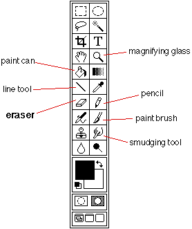
also be used to clarify the function of the icon. Consider the eraser icon
used in a number of drawing and painting packages on the Macintosh. Its
representation is usually as in figure 3.6, amongst the other tools on the
tool palette in Adobe PhotoShop. A naive user could be forgiven for not realising
what the icon was meant to represent, although once used, it becomes obvious
that it is an eraser. One possible way around this is to represent the tools
using an animated representation - actually show the eraser rubbing something out
for example. Baecker and Small have developed an animated eraser on a tool palette
[Baecker & Small, 1990] (see figure 3.7). The particular animation also
involved showing the eraser singing an "eraser song", all about what it did
and how it did it. While this was evidently an extreme example, it was obvious
that once you'd seen it you would not forget about the eraser. Such an animation
would appeal to children and be informative.


fig. 3.6 (left) Tool palette in Adobe PhotoShop 2.5.
fig. 3.7 (right) Views of an animated icon for an eraser [Baecker & Small, 1990].
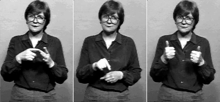
QuickTime is Apple Computer's video and animation system which brings support
for video and animated images to the operating system (see figure 3.8). A
number of alternative video systems are becoming available for other computer
systems. Currently, the main system in use is the MPEG system, so called because
it was defined by the Motion Picture Expert Group - a group of people who met
under the International Standards Organisation to generate standards for digital
video and audio compression. MPEG utilises sophisticated and cpu-intensive
motion-search algorithms to reduce the amount of data that must be stored for
a moving image. This system exists for the Macintosh, but is not as efficient
as QuickTime on that platform. MPEG I has been completely specified - it is
defined as compressed video and audio optimised to fit into a bit stream of
1.5 Mbits per second, which is the data rate of uncompressed CDs and DATs
(Compact Disc and Digital Audio Tape). Work continues on specifying MPEG II,
which is defined to fit into a bit stream of 3 to 10 Mbits per second. The
different specifications are suited to particular applications and physical
transport systems (playback from CDROM, transmission across Ethernet networks etc.).
Microsoft has produced "Video For Windows", which runs on PCs, and Apple
have ported their QuickTime system to the PC and other platforms, though only
for playback so far. If the PC is the required destination platform, the
current consensus seems to be to use Macintosh systems for the production and
editing of desktop video because the software tools are much more developed,
then to port to the PC when the production is complete. The wide variety of
hardware in the PC world leads to difficulties in supporting the complete range
of systems, and since video is so CPU-intensive, only a medium to high-end PC
system can cope with the data throughput.

fig. 3.8 - 3 non-consecutive frames from a sign-language QuickTime video used by the package.
3.6 Participative Development
Any project which calls upon a mix of people from different
disciplines can suffer from problems caused by the lack of familiarity of
the participants in all the relevant fields of knowledge. Being aware of just
what is wanted, and what is possible, can be a formidable task, and it is
usually the case that participative development (PD) leads to a new perspective
on behalf of both the users and the experts - what Erran et al. refer to as
mutual reciprocal learning [Erran et al., 1993]. Research in PD
shows that users involved in the design of a system feel increased competence
and confidence [Miller, 1993], they feel that they have important input
into an end product, and are not just passive users of it. This also means,
however, that users are responsible for the system that they get, and cannot
blame the experts if they do not like it. It has been shown, however, that it
is less likely for such a system to fail, since it has been tested in precisely
the way in which it is to be used, and by those who will be using it. It is the
responsibility of the computer experts to ensure that users are made aware of
the technological possibilities and limitations of the systems, and also to listen
to what the users want, and not to implement something that they don't want,
simply because it makes sense from a programmer's viewpoint [Bjerknes, 1993].
Erran et al. [Erran et al., 1993] refer to two themes which govern practical
implementation of PD, the first being mutual reciprocal learning, referred to above,
and the other design by doing, in which "low-tech" and more
recently "high-tech" tools are used to prototype the design. Low tech tools
include such things as white-boards, flip charts and Post-It notes. One of the
latest high-tech tools is HyperCard, used as a quick interface-prototyping tool.
HyperCard is particularly good for creating evolutionary prototypes.
Among the problems with the mixing of disciplines is the potential for
confusion over jargon used in the different domains. It is possible that some
jargon in one domain has a completely different meaning in another, or is a
concept that is totally alien. Participative Development had some bearing
on the development of the computer system documented in this thesis, and
this will be considered in section 7.3.2.
3.7 Costs and Consequences of Restructuring Interactive Software
The Macintosh computer was the first mass-market machine to offer an easy to use
graphical interface. This interface, which is used consistently across all Macintosh
programs, provides the user with an easy to use system, but gives the programmer
more work to do to produce even a simple program. The reason for this is that
although the operating system of the Macintosh provides many services that the
programmer needs to produce good, consistent programs, there are a lot more steps
to take to produce such a program. Take, for example, a program which asks for some
input, performs an operation on the input and then produces some output. In many
computer systems this would involve using for example the Pascal readln statement
to get input, and the Pascal writeln statement to produce the output. On the
Macintosh, for a program to remain consistent with other Macintosh programs,
input is received via a dialog box, whose contents and position must be defined,
and whose result must be converted into an appropriate form. Output is also usually
done via a dialog box, with all the appropriate code to set up and handle the
insertion of values. For example, figure 3.9 shows a typical Pascal program to
get input from a user, and to write some output after a calculation.
readln(InputNum);
{...}
{do some calculation here}
{...}
writeln('The output is: ',theResult:4);
fig. 3.9 Typical Pascal program to get input, perform a calculation and write output.
A similar program segment for the Macintosh follows in figure 3.10. Note that it
requires the definition of the dialog boxes to be set up in advance of their use.
One way of doing this is using Apple's ResEdit program, which is discussed in appendix E.
Meaningful variable names have been used in the listing, and in a real program,
these would have to be declared by the programmer.
InputDlog:=GetNewDialog(myInputDlogID,nil,pointer(-1));{show dialog}
repeat
    ModalDialog(nil,itemHit);{handle events until we get a mouse-click}
until itemHit=OKItem; {repeat until we click OK}
{get a handle Item to the text object that holds the input string}
GetDItem(InputDlog,TheInputStrID,ItemType,Item,ItemLocation);
GetIText(Item,InputText);{get the text we entered}
StrToNum(InputText,InputNum);{convert it into a number}
DisposDialog(InputDlog);{and put away the dialog box}
{...}
{do some calculation in here}
{...}
NumToStr(theResult,ResultText);{convert result into string for display}
OutputDlog:=GetNewDialog(myOutputDlogID,nil,pointer(-1));
{show dialog}
{get a handle Item to the text object that will be used to hold the result}
GetDItem(OutputDlog,TheOutputStrID,ItemType,Item,ItemLocation);
{replace the dialog box text item with the required string}
SetIText(Item,ResultText);
ModalDialog(nil,itemHit);{and wait until the user clicks something...}
DisposDialog(OutputDlog);{...then dispose of the dialog box}
fig. 3.10 Typical Macintosh Pascal program to get input, perform a calculation and write output.
From this small example, it can be seen that much more code is required to perform a task
on the Macintosh, than on a typical text-based computer system. It is this aspect of
Macintosh programming that means that Macintosh programs are typically much bigger
than would be the case on text-based systems. Programmers have to make more effort
to produce programs which are consistent with the Macintosh ethos, and Apple publish
guidelines which programmers should follow. Programmers who do not follow the guidelines
(and there are some) tend to produce programs which are more difficult or obscure to use,
and which often fail when there are upgrades to the Operating System, or changes in CPU.
There are, however, significant advantages to using the resource-based approach to programming,
particularly when modifications to the program are required. Since resources are separate
from the program code it is possible to change certain aspects of the appearance of some
objects by modifying the resources which define them. Such modifications do not require
the recompilation of the program source. It is also possible to write program code which
can take advantage of the number and type of certain resources available to it. For example,
replacing one picture by another, or by a sequence of video.
3.8 Summary
It has been shown in this chapter that there are many aspects to consider in the production of
an easy to use interface, and that the input of designers with skills in all the appropriate
areas of knowledge can lead to a system which a designer without this expertise could not
envisage. The next chapter examines the design of the computer system based on the SAGE
approach to interviewing covered in chapter 2, and utilising human-computer interaction
principles discussed in this chapter to produce an easy to use interface aimed primarily
at children.
back to Chapter 2. forward to Chapter 4
