Chapter 6
6. Enhancements
A number of enhancements were made to the package in the light of user-testing, and as extra
facilities became available within the Macintosh operating system. This chapter will examine
these enhancements.
6.1 Package Recoding
In the initial package design both the main program and each of the modules had a complete event-handling
loop (see figure 6.1). When a module was selected from the menu, program control passed to an
event-handling loop within the module, and only returned to the main program when the module
was completed, or if a new module was selected from the menu.
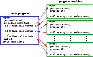
fig. 6.1 Original program control structure.
This technique had a number of negative aspects:
- Module code had to include event-loop code, and this had to be duplicated for each module.
- If changes were required to the event-handling loop code during package updates, each and
every module had to be modified.
- Only one module could be active at once, since one module could not call another.
For these reasons a different control structure for the modules was designed (figure 6.2), and
the following steps were taken:
- Modules were rewritten to remove the duplicated event-handling loop code. Instead, modules
have a number of public routines that can be called by the main program. The routines are:
- Dispatch, which handles initialisation, periodic events and exit.
- Update, which deals with redrawing a module's window contents.
- Event, which accepts events such as key presses and mouse-clicks etc.
- The main program event-handling loop had extra code added to deal with events that did not have
to be passed on to individual modules, such as the insertion of an uninitialised floppy-disk, which
on a Macintosh will call the disk-formatting package.
- The way in which each module accesses its local variables was changed. The local variables used
by a specific module are referenced via a single handle. These handles are global to the main
program. On initialisation, a module creates a handle. This points to an area which contains
enough space to store all of its local variables. Every time the module receives an event passed
to it via the main program it accesses its variables through the global handle. When the module
finally exits it releases the space occupied by its local variables.
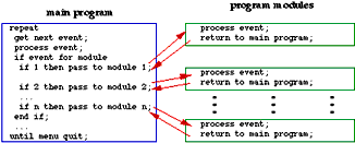
fig. 6.2 Modified program control structure.
By modifying the structure of the program in this way the modules were simplified, at the expense of
a slightly more complicated main program.
6.2 Training
Some of the modules are complex enough that a period of training is required before the child is able
to use them successfully. It is envisaged that most modules will have a training mode, and that this
will be accessed by selecting the module from the Training menu. Normally, when a module is selected
from the Module menu it runs without extra prompting which might obstruct children who already have
experience with the module. When a module is selected from the Training menu it runs in a training mode,
where extra prompting is given. In earlier versions of the package, training on a module occurred every
time the module was invoked, but as it became obvious that some modules might be used over and over again
during the course of an interview, it was decided that training should be split off from normal invocation
of the modules.
6.3 The Introduction Module
In early versions of the package there was a name module, which was merely there to collect the
name of the child and to record their gender for use in some of the later modules. It was decided that
owing to some adverse gender effects in the Emotions module (see section 6.4.3) which used to precede the
name module, that the gathering of the gender and name data should be moved to the start of the package
so that the information could be used in the Emotions module, and at the same time the age of the child
would be recorded. The name module was renamed "Introduction" when the changes were introduced.
6.4 The Emotions Tool
This tool was one of the first to be written, and although it has undergone a number of minor
modifications, there have been no major changes to it since it was first introduced. This is in contrast
to some of the other modules, which have needed completely redesigned interfaces.
6.4.1 Position of the Tool
Originally, this tool was designed as shown below in figure 6.3. This was in order to make the best
use of the screen area. Using a rectangle on the right-hand-side of the screen to hold the expressions meant
that the whole of the screen from the bottom of the menu-bar to the bottom of the display could be used for
the picture, with only a small area to the right in use by the tool. This sort of layout is similar to that
used by graphical-design applications on the Macintosh, with a palette down one side of the window.

fig. 6.3 - Original design. Emotions tool on the right-hand-side of the screen area.
This design was subsequently changed to that shown in figure 6.4, since visual scanning in a straight line is
much easier than in the original arrangement. This second design does have this "ease of scanning" factor
in its favour, and the fact that pictures may be wider. There is, however, the drawback that pictures that
are to be used with this tool cannot occupy the full height of the display. This must be taken into account
when the artwork is designed. This may be a problem where a complex picture needs to be represented. Although
it is possible to scale pictures, it needs to be remembered that the expressions fit into a particularly sized
oval, and if they need to be reduced in size to get them to fit, scaling will result in some loss of clarity
in the representation, and too much shrinking will turn what we hope is a clear expression into a black smudge.
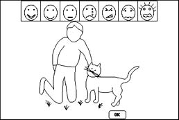
fig. 6.4 - Modified design. Emotions tool along the top of the screen area,
with intensity from left to right.
6.4.2 Problems with The Representations
Tests of the tool with children highlighted a number of difficulties, and a fair range of
responses, to what we had hoped would be standard representations (see chapter 5 for details). Those
expressions presenting the most difficulties from a recognition point of view were the "neutral"
expression, and the "frightened" one. After consultations with our artist, a modified expression
was designed. The original design and the modified version of the frightened expression are reproduced
below in figure 6.5. One point worth noting is that although both representations have hair which is
standing up, when the expression is applied to a scene, the hair on the child in the scene does not stand
on end. This is because although it is a simple matter to place the expression on the scene in a prepared
space (effectively just drawing a previously defined picture into a previously defined space within the
scene), in order for the hair to stand on end there would need to be artwork which showed the hair in
this state, and this would be the case for every scene whenever the "frightened" expression was
chosen. This would also have required extra programming, and at the time it was thought that the amount
of work involved outweighed the advantage that would be gained. It is possible that this inconsistency
may be fixed at some point in the future.

fig. 6.5 - the original and the modified designs for a "frightened" expression.
Another potential problem expression was the "neutral" one. The original design for this is
reproduced below in figure 6.6. A large number of children described the expression using the original
design as "bored" or "sad". Children were asked to draw faces and virtually every neutral face
had slightly upturned lips. The modification made to this expression was to move the corner of the lips
upwards by the smallest amount possible. This had the desired effect - more children were able to recognise
the expression.

fig. 6.6 original "neutral" expression, and the slightly modified version.
6.4.3 Gender Problems
When the tool was originally used, some of the scenes were drawn with mixed gender, some were
of boys and some were of girls, and no matter what the gender of the child using the package, the scenes
would always be of mixed gender. It soon became obvious, however, that there was a gender effect
coming into play, which affected the way in which the tool was used. Some boys would point out that
in a scene where a girl was shown next to a big spider, "Boys wouldn't cry if they saw a spider, but
girls would!". This same sort of problem was apparent in the scene where a boy has fallen off a
skateboard ("boys don't cry if they hurt themselves"), and where a girl was sitting on a see-saw
("a sissy thing to do"). In order to alleviate this effect, scenes were redrawn, and versions of
the scenes were created for both genders. The package was modified so that girls got scenes with girls
in, and boys got scenes with boys in. This successfully reduced the gender effect.
6.4.4 Splitting The Emotions Tool Into Two Parts
The research assistant introduced the emotions tool to the child by getting them to ignore the
scene on show, and to describe the faces in the tool. For this reason it was decided that it would be a
good idea to permit the user of the package to call up the emotions module, with a picture of a child of
the appropriate gender, and the tool, but without a scene on show. The child could then talk about the
expressions, and what they thought they meant, without the scene getting in the way. This was referred
to as "Emotions I", and the normal scene-based use of the tool as "Emotions II" (figure 6.7).
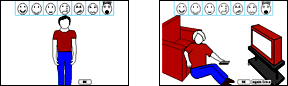
fig. 6.7 The Emotion tool with a picture of a child, used for talking about the expressions, and the
same tool with a scene containing a child, used to describe how the child feels about that particular
scene.
It was discovered that some children tended to describe the face rather than the emotion (for example
in fig 6.5, one child described the frightened face as "shouting"). The splitting of the tool
allows Emotions I to be used by the interviewer to ask the question "what is this child feeling?",
in order to assess the ability of the child to visually discriminate, and their understanding of the
subtle differences in emotions. It can then be seen if extra preparation work needs to be done before
the tool can be used to assess the child's feelings about the various scenes, or indeed if it is relevant
or useful to continue. Since Emotions I may be used in whatever way the interviewer sees as appropriate,
it provides scope for use in extra preparation work in understanding and indicating emotions. It also
allows the interviewer to get an insight into the idiosyncratic language of the child, and their general
language ability.
6.4.5 Emotion Indicator
In order to act as an indicator of the the chosen expression, a rectangle is drawn around the
expression in the tool when it is selected (figure 6.8). This is particularly useful in scenes which
have other individuals as well as the child representation, where the other figures' expressions can be
seen.

fig. 6.8 tool with no expression selected, and indicating the sad expression has been selected.
The scrapbook, with which the child was supposed to select a picture of a house, underwent
several modifications from its original design (see section 4.4.2).
6.5.1 Method Of Operation
The original Scrapbook design asked the child to look through every item in the scrapbook first, and
then click on the picture of the house that they wanted to choose, whereupon it would be "torn"
out of the scrapbook and placed on the right-hand side of the window. The child could then continue
to browse the scrapbook, and could select a different picture, which would replace the previously
selected one on the right-hand side of the window. If the child clicked the selected picture it would
return to the scrapbook. All of this could continue until the child clicked OK while they had a picture
on the right-hand side of the window (i.e. a selected picture). There were several problems with this:
- Owing to the size of the window in which the items were drawn, the pictures in the Scrapbook were
larger than the versions which appeared when they were torn out and displayed on the right-hand side.
It feels wrong to have the item that you want to choose, smaller than the items that you do not want.
- The method of operation was complex, and would therefore require training, and this would not be
suitable for some of the target audience.
- The fact that the child must click on things, but only at certain times (only when they've looked all
the way through the items in the scrapbook), meant that there should be some way of indicating that it
was OK to click in certain places (the pages of the book, or the torn out pictures).
- It was difficult to remember how many items had been seen, and impossible to know how many items were
coming.
Navigation through the scrapbook was by the "dog-ear" at the corner of the page (see figure 6.9).
Clicking on one-half of the dog-ear moved forwards through the book, and on the other half moved
backwards, so that if the child moved too quickly past a picture that they actually wanted, they
could go back to it, without having to go all the way through the rest of the pictures first. Some
children found it difficult to place the mouse accurately so that they ended up going backwards and
forwards seemingly at random.
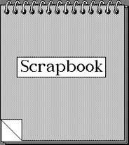
fig. 6.9 The scrapbook cover page showing the dog-ear in the bottom left-hand corner.
In order to tackle some of these problems the interface was changed in the following ways:
- Use was made of the "sticky finger" (see section 4.1.3) to indicate that it was OK to click on
pictures at certain points (after the child had seen the whole contents of the scrapbook the sticky
finger is active over any page of the scrapbook, and over any previously dragged-out picture). Since
the sticky finger is used to indicate that something should be dragged, animation of the picture
following the mouse cursor around the screen was used. The child could click to drop the picture
either back into the scrapbook, or else onto the right-hand side of the window, which had a notice-board
graphic drawn on it.
- Page numbers were added to the top right-hand corner of the pages of the Scrapbook.
- The size of the scrapbook itself was slightly reduced, and the size of the area into which the
selected picture was drawn was increased, bringing the sizes of the two closer together.
- Both halves of the dog-ear were set up to move the child forwards through the book, which effectively
doubled the area that could be clicked in. In order not to lose the advantage of being able to go
backwards a page at a time, pressing the backspace key allowed a move backwards.
6.5.2 Scrapbook Problems
Despite the changes discussed above, the Scrapbook proved to be difficult to use:
- It required that the child had to remember all the items in it in order to compare those with
the one that they could see on the page. For a small number of items this was not too difficult,
but if there were more than a few items the task became quite difficult. Adults would have had less
of a problem, and, in fact, Apple use a Scrapbook interface to allow users to store items copied
from documents.
- It had several controls, and the child would have to be trained in the operation of each of them.
- The presentation of the pictures inadvertently turned out to be in an increasing level of poverty.
The ordering went: detached, semi-detached, bungalow, block of flats, children's home, above a shop,
boat, caravan. This was a completely unexpected side-effect of ordering the pictures into the pages of
a book.
For these reasons, a new hierarchical tool was designed instead.
6.5.3 Replacement for the Scrapbook
This new tool presents the child with a set of buildings of up to eight different types. These are
laid-out on the screen in previously defined locations, designed to make the best use of the
available screen-space. The figures of the tool included here show pre-release artwork. Figure 6.10
shows the standard display of the main types of buildings that may be chosen when the tool starts up.
Clicking on a type of building causes all the other types to be put away in a box, and representations
of the clicked-type to be displayed instead (see figure 6.11). This can be repeated until finally a single
building is displayed (figure 6.12). Clicking on that brings up a dialog box which asks if this is
the chosen building. At any time, the child may click on the box (which conceptually contains all the
unchosen items), whereupon all the currently displayed buildings vanish, and the buildings which
constitute the set before this one are displayed (effectively moving back a level through the
hierarchy).
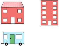
fig. 6.10 in this demonstration there are three types of "building", house, flat and caravan.
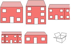
fig. 6.11 having clicked on the house type, various types of house are now shown along with the box
that holds the unchosen items from the previous level.
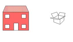
fig. 6.12 clicking on the detached two storey house puts the other unwanted items into the box.
If the child selects a building when only one remains, then they are asked if that is the one that
they want.
It is envisaged that at this point, the child will be able to further customise the chosen building
by dragging extra items onto it - adding windows, and various bits of ornamentation to the basic
shape. These are refinements to the buildings tool, which are fully planned, but which are yet to be
implemented.
(formerly called "The Family Chooser")
6.6.1 The Original Set of People
As the people chooser has evolved, the individuals available for choosing have changed.
Figure 6.14 shows the original standard universal set , along with the two adaptations to it, the
last of which is the current one.
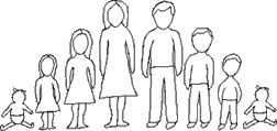
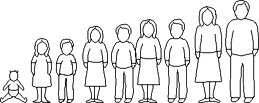
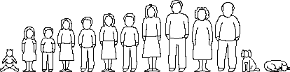
fig. 6.14 the original and two adaptations to the standard universal set.
The adaptations have been:
- To reorder the people and put them in age order with alternate genders together.
- To add some middle children and to remove one baby. For our purposes the baby represents both male and
female children.
- The addition of older adult figures (represented by the artist as slightly fatter, and in the case of
the male figure, slightly balding) , and a dog and cat at the request of children who used the package.
Originally there was no way to tell if the child had included themselves in the family that they had
created using the people chooser. This was a problem when there was a requirement later in the package
to ask the child to say how they felt when they were with certain family members (the Emotions and
People module). It would not make sense to include the child in the group of people that they were
asked about. For this reason a module was written to allow the child to say:
- Whether or not they had included themselves in the family that they had chosen.
- If so to indicate which of the pictures was a representation of them.
- If not, if they would like to choose a picture to represent themselves, and if so, to be presented with
the universal family so that they could choose a person from it to represent themselves.
This module makes use of the services of a routine used by the people module. Initially the
choose-an-individual routine was built into the people module. It became obvious later that a
number of other modules of the package would benefit from being able to draw groups of people, and
some from being able to select individuals or groups of people. For this reason the routine which
permitted the selection of an individual and the routine which draws sets were moved out of the people
module and put into a place where they would be generally available, where they could be called from
the people module, and from any other module which required to be able to choose an individual, or
draw a group of people (currently the People Module, Child Representation Module and Emotions and
People Module). Since theses routines had been implemented as subroutines within the people module,
it was a relatively simple matter to extract them, and place them in a support module of their own,
along with the family-drawing routine, from where any appropriate module could access them.
The Emotions and People module has undergone a number of changes and is currently in its
fourth interface incarnation, with a fifth one planned. The four versions will be described here.
A problem arose as to how best to display all the required elements of the tool - the family, the
image of the child with the appropriate emotional expression, and a further reminder of the expression
itself, in the limited screen-space available. There was the further problem of indicating in some way
those members of the group whom the child had chosen, and those that they had not. There was also the
question over exactly who was supposed to be feeling the emotion in question. The emotion was supposed
to be felt by the child when they were with the person in question, not necessarily vice versa. A number
of alternative interface ideas were tried, and formed four main versions presented here:
6.8.1 Version I
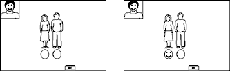
fig. 6.15 Version I of the tool. Note that each family member has a blank face oval drawn underneath them,
when selected the face under consideration gets drawn into it. The face at top-left is a reminder of
the child with the expression.
In this version (shown in figure 6.15) each family member had a blank face drawn below them. If they
were chosen, then the face below them had the expression that was under consideration drawn into it.
This suffered from the problem that it was the emotional state of the child that was under consideration,
but because the faces were close to the other people, they gave the impression that it was the selected
person that had this expression. Boxes into which a tick or cross could be put were considered, but this
had positive/negative connotations, and so was rejected without being implemented.
6.8.2 Version II
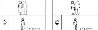
fig. 6.16 Version II of the tool. Note that the unselected family members are drawn in grey, the ones
that the child has chosen are drawn in black. Note that the right-hand screen-image shown here, is the
final step after the selected person has returned to the top-half of the window.
In this version (shown in figure 6.16), the screen was split in half by a horizontal line. The child was
drawn below the line in the centre, with a reminder of the expression under consideration drawn on the
left-hand side. Each family member was drawn above the line in grey. When they were clicked on, a
drawn-in-black copy of their picture came down to join the child, and a dialog box popped up asking
if this was OK. If the child clicked OK then the drawn-in-black picture moved above the line, if No
was clicked then the grey picture was put back (and hence this individual had not been chosen).
Clicking on a drawn-in-black picture made it toggle back to grey, de-selecting the person. There were
a number of problems with this, not the least of which is that it is a rule of the Macintosh user
interface that greyed-out items cannot be selected, items drawn in grey are always unavailable for
whatever reason. To have an interface which relied on selecting a greyed-out object would go against
the interface guidelines. Also, the interface itself was very cluttered and very complex. There had to
be a better way - one which was more in line with the rule about the use of greyed out images.
6.8.3 Version III
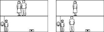
fig. 6.17 Version III of the tool. Note that the selected family member has been drawn in the bottom section,
wherever the child dragged the image to.
This version (shown in figure 6.17) was similar to Version II, but the child was drawn over to the
bottom-left near the reminder of the expression, and the individuals can be dragged around by clicking
on them with the sticky finger cursor. When they are dropped in the bottom part of the window they
stay in that position, but align with the bottom of the frame (i.e., their new location is horizontally
the same as it was when they were dropped, but in order for them not to look as if they are floating,
they are brought in line with the "floor"). If they are picked up from the bottom and dragged to
somewhere in the top part they return to where they were originally drawn in the top section. When
the child has finished considering this expression, all the selected individuals are in the bottom
section of the display, and the unselected ones in the top section in this version of the tool, and
they all return to the top when the next expression is considered.
6.8.4 Version IV

fig. 6.18 Version IV of the tool. Note the inclusion of the "someone else" button for adding an
extra person to the group of people in the top section.
The differences between this version shown in figure 6.18 and version III, were the addition of a
button (referred to as the "someone else" button, shown in figure 6.19), which allows the
inclusion of a previously unspecified person into the group, the inclusion of the names shown below
each person to assist in differentiating between family members represented by copies of the same
picture, and the fact that when people are selected they drop into the bottom section in the next
free slot near to the child (no dragging and no sticky-finger are needed).

fig. 6.19 The someone-else button.
The original version of the somatic experiences tool is reproduced below in figure 6.20. A
number of modifications were made to the operation of the module during the course of its development.
These are summarised below.
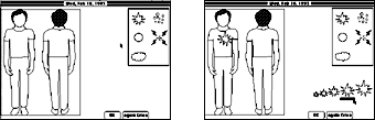
fig. 6.20 - original somatic experiences tool. View of pain-type palette, body views, and size-selector.
On the right - choosing a size for the current pain-spot.
6.9.1 The Pain Palette
The pain palette offers a selection of pain types (see figure 6.21). For a brief description
of the current pain types, see table 5.2 in chapter 5.
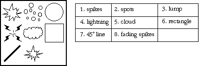
fig. 6.21 Current pain palette & description of pain-types.
The palette was adapted to enable it to display animated representations for pain shapes. Some types
are difficult to visualise without movement; itchiness for example. Pain types are drawn into the
palette in equal size. When the somatic experiences module is first initialised a check is made on
the number of pain types, and each representation is drawn into a fixed-size rectangle. Originally
the size of the rectangle was based on the size of the largest pain-representation in the pain-type
palette. This was modified to base the fixed-size rectangle on the middle size in the pain-size/intensity
palette. The palette is drawn large enough to hold sufficient of these rectangles for all the pain
types. When a pain-type is selected for a pain spot, the type is marked in the palette by surrounding
it with a rectangle (see figure 6.22).
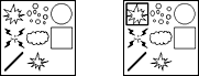
fig. 6.22 pain palette displaying the current default pain types.
The one on the right has the top-left pain-type selected.
6.9.2 Throb-Speed Control

fig. 6.23 throb-speed slider control.
The throb-speed slider (figure 6.23) is used to alter the rate at which a particular pain spot which
has more than one stage (and hence may be animated), moves through all the stages of its animation.
Not all pain types can be animated, but those that can, consist of a series of pictures representing
the different stages of the animation. When the throb-speed is increased, the delay time between
subsequent stages is reduced - speeding up the animation. This control has proved to be difficult to
use, and so it is intended that it will be replaced - most probably by a set of four buttons,
representing four speeds - "Off", "Slow", "Medium" and "Fast" (figure 6.24).
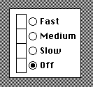
fig. 6.24 proposal for throb-speed control. The blocks on the left flash at the specified rates.
6.9.3 Size/Intensity Palette
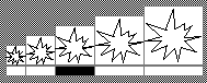
fig. 6.25 the size/intensity palette.
The size/intensity palette (figure 6.25), is used for choosing and displaying the size/intensity of a
particular pain spot. There are five possible sizes for a pain spot, the default is the middle value.
This is also the size used as the basis for the pain-types in the pain palette. An indicator rectangle
was added to the palette to appear under the selected size. A particular size can be selected by
clicking on the appropriate part of the indicator, as well as in the rectangle that defines the size
of the pain-spot.
6.9.4 Alleviating Clutter in the Somatic Experiences Tool
In early tests it was discovered that children found the somatic experiences tool to be too
cluttered to be able to use it easily, as there seemed to be little structure to the various elements
of the tool. An attempt was made to redesign the tool to reduce the clutter. Boxes were drawn around
the differently sized views in the size-palette, and an overall grey background was added to surround
the various parts of the tool (see figure 6.26). From early tests with users, these modifications
have helped to make the interface clearer.
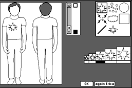
fig. 6.26 The current version of the somatic experiences tool.
An alternate method of moving through the package was created by the production of a
"navigation palette" (figure 6.27) which allows the user to select a module by clicking on
a graphical representation of it. The palette contains a pictorial representation for each of
the modules. When the package first starts up, every module except the first (the Introduction
module), is unavailable for selection. Pictures representing the other modules are drawn greyed-out.
They only become available for selection after the user has gone through the Introduction module,
since it is this module that gathers information about the gender of the child, and this is used by
some modules to tailor their presentation. This is equivalent to the way that the Module menu works.
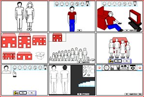
fig. 6.27 "Navigation Palette" - allows a user to choose a specific module without recourse
to the Module menu.
In the first implementation, the palette simply has the same effect as selecting the appropriate
menu option from the Module menu. However, future implementations are planned: possibly adding the
ability to construct a path through the modules of the package by clicking on the pictures of the
modules in the sequence required.
When the package was originally designed it was thought that the route through the package
would be to consider places, to populate them using the Family module, and then to see how the
child feels when they are with that population . It then became apparent that there are some places
where building a population would be difficult to do: when considering a school setting, for example,
where there are many individuals. It would be easier to consider a place, ask how the child feels,
and then let them pick people that they feel that way with, augmenting the set of people using the
"someone-else button". In this case the package would be place-led and not people-led as in the
original concept. It is intended to offer both routes so as to be able to handle places that are
suitable to one route rather than the other.
The Family module was originally designed to handle families in houses, or places where the
child visited. This has now expanded to consider groups of people who are in a place, whether they
live there or work there or just happen to be there. For this reason the concept of "family"
was one which was no longer appropriate to the name of the module, or the operation of the package.
This prompted a change in the name of the various structures in the package holding information about
these groups of people, and the idea of the "set" was conceived to refer to a set of
people consisting of a number of individuals. At the same time, the idea of a "Setting" has been
discussed, and it is envisaged that it will work in the following way: Every group or set of people will
have a specific place or setting associated with them, even if the setting is just
"outside", or "school". The type of setting will have an impact on the route through the
package; "outside" and "school", for example, would be place-led (see section 6.11). In advance
of the child using the package, the psychologist would find out about the child's "universe": the
places they visit, where they live etc. This information would be used to build information about
settings to discuss ("Think about places you used to live in"), and the sort of people that may be
found in them. This offers the adult user of the package the chance to set up appropriate people for the
child to choose from, to populate the setting. It would still be possible to talk about a setting that
the psychologist has not discovered and planned for in advance, but by providing settings before the child
starts to use the package it is ensured that none of those places are unintentionally missed in the
interview itself.
Although most modules have undergone some changes, the modules have to a large extent remained
fairly consistent with their original designs. Tools have been augmented as more computing power has
become available - adding support for animation, and colour/grey-scale has been used now that most,
if not all, systems come with display screens capable of other than 1-bit black and white. As new uses
for some of the modules have become apparent, features have been added to permit wider applicability.
back to Chapter 5. forward to Chapter 7